A ViewBox control is a generalized (and extremely versatile) way of creating various types of controls on a page. A ViewBox control allows you to create controls that have 'behaviors'.
Like all controls on an HTML page, a ViewBox controls is, at its core, just some HTML and Javascript that renders some text on the HTML page.
Of course, you might think that putting HTML on a page is easy - simply create a Static Text control and set the text of the control to the HTML that you want to display - so why would you need a ViewBox to do this? Unlike static HTML, the HTML rendered by a ViewBox can be dynamically generated by merging data into an HTML template using the client-side templating feature in Alpha Anywhere.
Similarly, you might think that assigning behaviors to arbitrary HTML is also easy - simply add an attribute, such as onClick, to the HTML that you render - so again, why would you need a ViewBox to do this? Event binding in the ViewBox is very efficient because event delegation is used - events are only added once, rather than for each instance of a template that is duplicated many times as the HTML is rendered.
Another key point about the ViewBox is that the ViewBox has the concept of a selection and state. Just like you can 'select' a row in a List control, parts of the ViewBox can be selected (and the corresponding selected CSS is applied to the selected text) and the state of the ViewBox is set when a selection is made.
The examples show below are all very different in appearance, but they are all created using the ViewBox control.
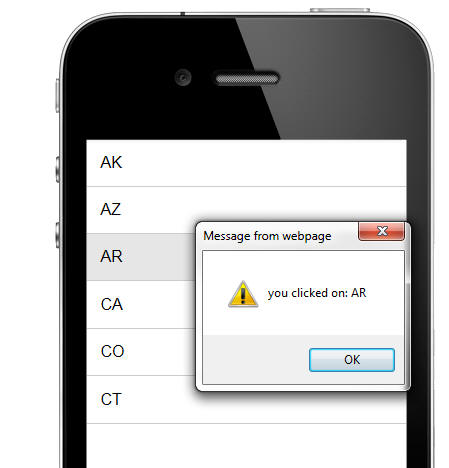
Example 1 - A list of entries. In this example, the ViewBox is acting much like a List control. However, it implements just a small fraction of the List functionality (i.e. drag scrolling and an event when a row is selected) and is therefore significantly 'lighter weight' (i.e. less load on the browser memory utilization) than a List control. If you simply need a scrollable list of entries with events on each row of the list, a ViewBox might be a more efficient solution than using List controls.
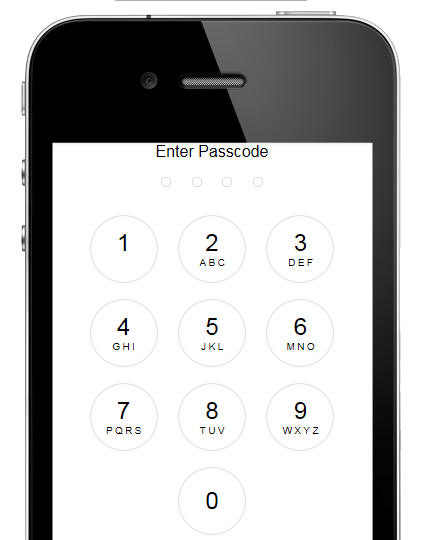
Example2: An iOS style login screen - This example implements an iOS style login screen.
Watch Video
- Part 1
Watch Video
- Part 2
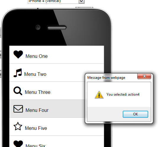
Example 3 - A menu List - This example is similar to example 1. It is an example of a scrollable list of items with event on each row
Example3 - A 'star rating' control - This example shows a series of
stars. The user can click on a star and all of the stars to the left of
the star that is clicked become highlighted. The
{dialog.object}.getValue() and
{dialog.object}.setValue()
methods can be used to programmatically set the number of highlighted stars.
Watch Video
- Part 1
Watch Video
- Part 2

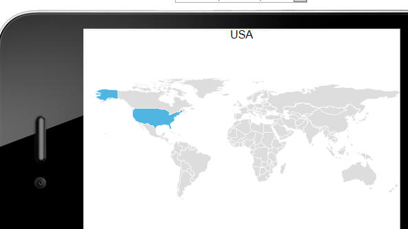
Example 4 - In this example, the HTML that the ViewBox renders is actually a map of the world, rendered using SVG. When the user clicks on a country on the map, the 'value' of the ViewBox control is set to that country (and shown at the top of the screen). Similarly, if you were to use the {dialog.object}.setValue() method to set the value of the ViewBox to (say) 'Brazil' then Brazil would be highlighted on the map -- and the previously highlighted country (if any) would automatically be de=selected.
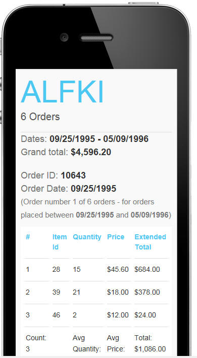
Example 5 - This example shows how rich HTML output can be created by merging data in a Javascript object (the object is an array of customers with nested arrays of orders for each customer and then nested arrays of order details for each order). This example can be thought of as a client-side report writer. It would be easy to make various parts of the report 'hot' (i.e. fire events) by adding event handlers into the HTML template defined in the ViewBox.
NOTE: The template used to create this ViewBox is quite complex. To view a video tutorial on how this template was constructed open the Video Finder (Help, Video Finder) and search for video UX_V12-118.
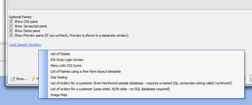
NOTE: All of the above examples can be created easily by opening the ViewBox builder, and clicking on the Load Sample ViewBox hyperlink on the Home tab of the ViewBox builder.
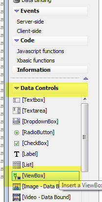
The ViewBox control is one of the Data Controls in the UX Builder. To add a ViewBox control to a UX component, click on the [ViewBox] item in the toolbox, as shown in the image below.
The ViewBox control is termed a 'Data Control' because, like other data controls (such as Textbox, Textarea, etc), a ViewBox control has a 'value' (that can be set or read using the standard UX Component {dialog.object}.setValue() and {dialog.object}.getValue() methods), and when the UX component is submitted to the server, the 'value' of any ViewBox controls are submitted and are available in the e.dataSubmitted object that the server side events can access.
A ViewBox can either be based on static HTML, or based on data (in the form of a Javascript object). In the case of static HTML you simply enter the HTML that the ViewBox displays in the ViewBox Layout pane in the ViewBox builder.
In the case where the ViewBox is based on data you will need to define how the ViewBox will get its data. You will also need to define an 'HTML template' (in the 'Layout' pane of the builder). The actual HTML rendered by the ViewBox is obtained by merging the data into the template (using Alpha Anywhere's client-side templating features - search Release Notes for 'Client-side Templates' for more information).
The data for the ViewBox can be:
In the case where the ViewBox data is based on a Database Query you can specify:
The ViewBox layout is where you define the actual HTML that the ViewBox will render.
In the case where the the ViewBox is based on 'data' (as opposed to static HTML), you define an HTML template for the layout and the actual HTML displayed by the ViewBox is generated by merging the data into the template.
In the case where the ViewBox layout is static HTML (i.e. it is not generated by merging data into a template), the HTML can either be specified at design time, or it can be returned by a Javascript function at run-time.
Items are how you add event handlers to the ViewBox. You can define as many items as you want. Each item that you define has properties such as onClick, onDblClick, etc. that define the code to execute when the user clicks, or double clicks on some HTML that specifies an item.
For example here is an HTML snippet that specifies an item
<div a5-item="item1">contents of div</div>
Assume that the item 'item1' defined on onClick event handler with this code:
alert('hello')
When the ViewBox was rendered and the user clicked on the text the alert would be displayed.
When you add an item to the HTML you can specify and optional 'item attribute'. For example
<div a5-item="item1:item_attribute1">contents of div</div>
When any of the event handlers (such as onClick, onDownHold, etc.) for this item are fired, the item attributes will be available to the to Javascript code (in a special variable called ia ).
When you add an item attribute to some HTML (using the a5-item attribute, as shown above), you can also specify an a5-value attribute. The value of the a5-value attribute will also be available in the event handler code (in a special variable called v).
For example:
<div a5-item="item1:item_attribute1" a5-value="v1">contents of div</div>
The onClick event for 'item1' could be:
alert('Click event -- item attribute is : ' + ia + ' and item value is: ' + v);
The item 'value' (as set by the a5-value) attribute defines what 'value' is returned by the ViewBox control.
For example if the ViewBox HTML is as shown in the above example, if the user clicked on the div (and assuming that the 'item1' had been defined as 'selectable'), then the ViewBox 'value' (as returned by the {dialog.object}.getValue() method) would be 'v1'.
Similarly, if the {dialog.object}.setValue() method was used to set the value of the ViewBox to 'v1', then the div would be displayed as 'selected' (i.e. the 'selected classname' as defined in the definition for 'item1') would be applied to the div.
For each item that you define, you can specify if the item is 'selectable'. If an item is selectable, then when you click the HTML that is bound to that item, the corresponding selected classname (defined for the item) is applied to the HTML (to indicate that the item has been selected).
Your template can reference the current ViewBox value by using the special [temp].value variable.
For example in the sample 'star rating' ViewBox (see video Watch Video - Part 1 Watch Video - Part 2 ), you will see that in the ViewBox template, the following code is used in the {*if} conditional block to determine if the 'selected' classname should be applied to the div:
<div class="star {*if [temp].value >=1}selected{*endif} " style="display:inline-block;" a5-item="starclick" a5-value="1">
..... div content....
</div>
In addition to the special [temp].value variable, your ViewBox template can also reference the special [temp].state variable to get access to data in the ViewBox's state object. For more information on this please watch the video.
The following are the key ViewBox methods:
NOTE: In all of the examples, <viewBox> indicates a reference to the ViewBox control, obtained using the {dialog.object}.getControl() method. For example
var vb = {dialog.object}.getControl('MYVIEWBOX1');
<viewBox>.populate(dataObject) - populates a ViewBox with new data. (Only applies if the ViewBox type is set to 'data')
Example:
var vb = {dialog.object}.getControl('MYVIEWBOX1');
var data = {name: 'Fred Smith', age: 23};
vb.populate(data);
vb.refresh();
<viewBox>.refresh() -- refreshes the ViewBox rendering the HTML again (merges data into the template)
<viewBox>.setValue( value [, flagFireChangeEvent]) - sets the ViewBox value. If flagFireChangeEvent is true, the change event if first. Default for is flagFireChangeEvent true.
<viewBox>.setLayout(layoutName) - sets the active ViewBox layout. Assumes that the ViewBox was designed to have multiple layouts.
<viewBox>
<viewBox>.setDisables(true/false) - set the ViewBox control to be disabled.
<viewBox>.scrollToItem(value) - scrolls the ViewBox to the item with the specified value. You can also specify an element Id using the syntax: #elementId
<viewBox>.getEelement(value) - returns an array of HTML elements that match the specified value.
<viewBox>.setElementClass(value, className) - sets the CSS class of an element with the specified value.
<viewBox>.addElementClass(value, className) - add the CSS class to an element with the specified value.
<viewBox>.remiveElementClass(value, className) - remove the CSS class from an element with the specified value.
<viewBox>.setState(object) - sets properties in the ViewBox's state object
Example:
var vb = {dialog.object}.getControl('MYVIEWBOX1');
var obj = {name: 'Fred Smith', age: 23};
vb.setState(obj);
vb.refresh();
<viewBox>.getState() - returns an object with the ViewBox's state object
<viewBox>.clearState() - clears the ViewBox's state object
<viewBox>.setElementDisabled(valueOrId, true/false) - sets an element to be disabled. valueOrId is the ViewBox value, or an id specified using the syntax: #elementId
Example
Assume that the Viewbox contains this markup in the template
<button a5-item="item1" id="button1" >Click me</button>
Here is javascript to disable the button:
var v = {dialog.object}.getControl('v1'); //get
pointer to the viewbox
v.setElementDisabled('#button1',true);
//if the 'item1' items specifies a disabled classname,
//it would be applied to the button.
<viewBox>.navigate(direction) - selects the specified item in the ViewBox. direction can be: first, last, next, prev
| UX Component - ViewBox Control | Introduction to Basic Concepts |
This video demonstrates basic concepts of the
ViewBox control such as the a5-item attribute
and the a5-value attribute and shows how events
are attached to the ViewBox and how parts of the
ViewBox can be made 'selectable'. Watch Video Download Component Date added: 2016-03-13 |
| UX Component - ViewBox Control | ViewBox HTML Rendered by Merging Data into a Template |
The HTML that the ViewBox displays can be
generated dynamically by merging data into an
HTML template. Watch Video Download Component Date added: 2016-03-13 |
| UX Component - ViewBox Control | ViewBox HTML Rendered by Merging Data Array into a Template |
The data that is merged into the ViewBox
Template can be an array of objects. In this
video we show how the template is expanded by
iterating over all of the objects in the data
array and how the resulting HTML can be
formatted to look and behave like a simple List
control. Watch Video Download Component Date added: 2016-03-15 |
| UX Component - ViewBox Control | Making a ViewBox Behave Like a Simple List Control |
A common use case for a ViewBox control is to
implement a simple List control. In cases where
you don't need the full richness of a List
control, but you only want to create a
scrollable list of items, the ViewBox represents
a simpler option. In this video we show how the special ListRowContainer control can be used to make a simple List using the ViewBox. Watch Video Download Component Date added: 2016-03-15 |
| UX Component - ViewBox Control | Sample ViewBox Walkthrough - Star Rating Example |
In this video we do a behind-the-scenes
walkthrough on the sample 'star rating' ViewBox
Control. Watch Video - Part 1 Watch Video - Part 2 Date added: 2016-03-15 |
| UX Component - ViewBox Control | Sample ViewBox Walkthrough - iOS Login Example |
In this video we do a behind-the-scenes
walkthrough on the sample 'iOS Login' ViewBox
Control. Watch Video - Part 1 Watch Video - Part 2 Date added: 2016-03-15 |
| UX Component - ViewBox Control | Understanding the Concept of 'Selectable' Elements in a ViewBox |
One of the key concepts of the ViewBox control
is that elements in the HTML rendered by the
ViewBox control can be 'selectable'. In this video we explain this concept by taking a complex ViewBox layout that does not have any selectable elements and making portions of the ViewBox HTML selectable. Watch Video Download Component Date added: 2016-03-15 |
| UX Component - ViewBox Control | Understanding the ViewBox State Object |
The ViewBox has a 'state' object and the values
in the state object can be used in the ViewBox
template. In this video we show how the template can reference values in the ViewBox state and how the ViewBox's .setState() method allows you to set properties in the ViewBox state object. Watch Video Download Component Date added: 2016-03-16 |