In this document and accompanying video we will take a look at some of the new functionality of the window object in the UX Component builder.
In this example we have built a simple component that has two buttons, both of which use action Javascript to open a pop-up Javascript window:
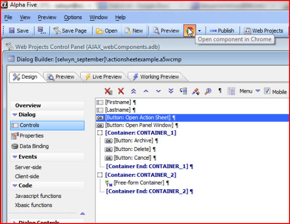
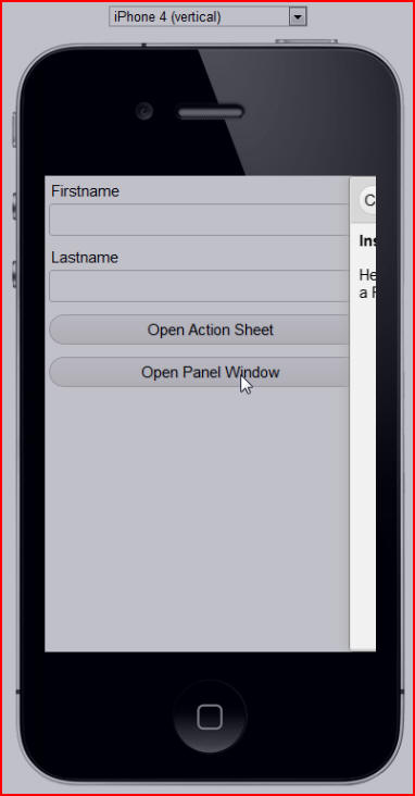
We can run the component to see the result. By first clicking Save then checking the Mobile box we will then be able to run it as a mobile preview:
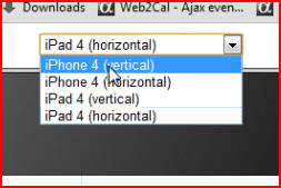
We can choose which type of mobile device we would like to view:
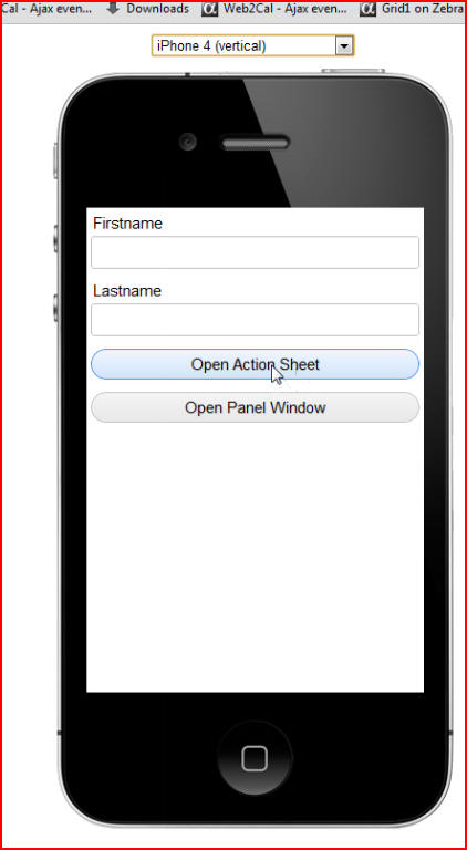
For this example let's choose iPhone 4 (vertical), then click the button Open Action Sheet to open a type of window called an Action Sheet:
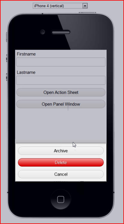
The Action Sheet pop-up window opens from the bottom of the screen using very smooth, hardware-assisted animation:
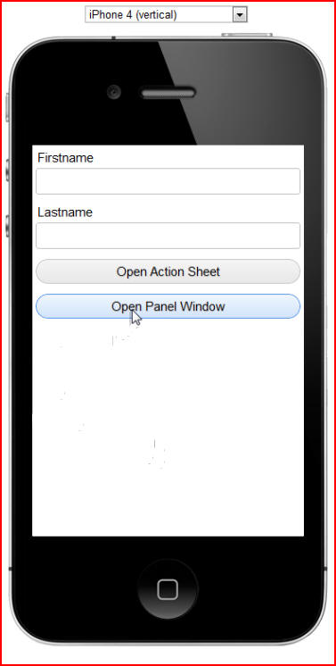
The Open Panel Window button opens another type of window, a Panel window, that slides in from the side of the screen:
Both of these buttons use the same Window Object in Alpha 5, but they are configured differently. Let's look at how they were created and see the enhancements that have been made to the builder.
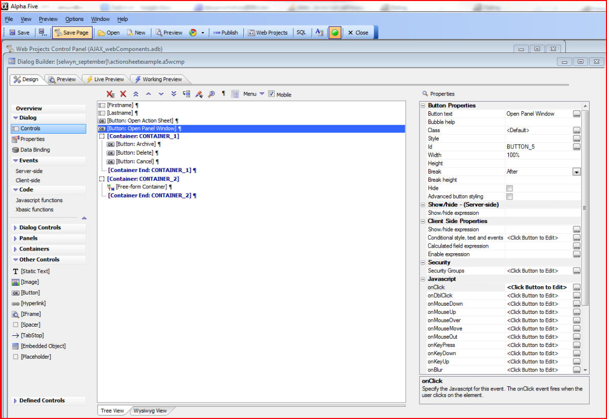
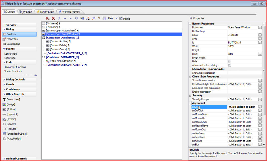
By going back to the Builder we see the first button, Open Action Sheet, and we can edit it by clicking on the Javascript onClick edit button:
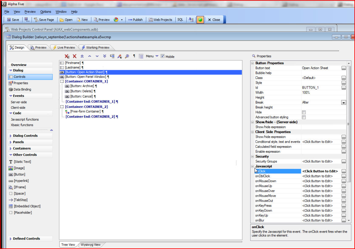
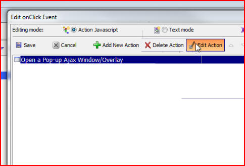
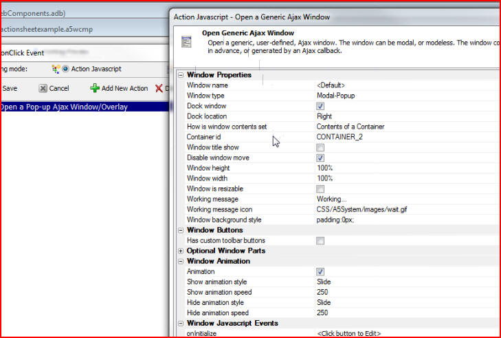
When the Edit window opens we see that the Open Action Sheet button is a standard action in Javascript called Open a Window, and we can click on Edit Action to see how the window is configured:
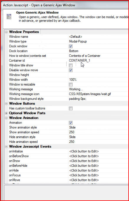
We can see that the window has been configured to display the contents of CONTAINER_1, (in the builder we can see that CONTAINER_1 has three buttons - Archive, Delete, and Cancel) and the window properties are set to enable the window to act like an Action Sheet:
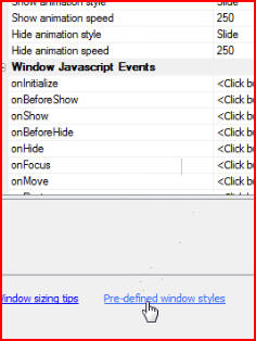
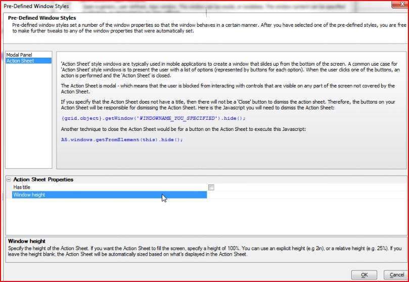
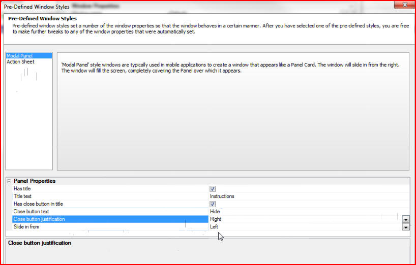
Knowing which properties to set can be a challenge, so there is a genie at the bottom of the editing window, called Pre-defined window styles. This genie allows you to very quickly emulate common patterns that you see in mobile applications:
When the Pre-Defined Window Styles window opens we can choose either Action Sheet or Modal Panel window styles. First we will choose Action Sheet, and in Action Sheet Properties opt for an untitled window by leaving Has title unchecked, and we will leave Window height blank so that the window will automatically conform to the correct height for its contents:
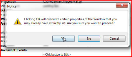
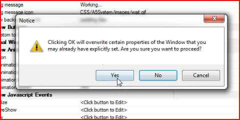
By clicking OK, then Yes on this Notice window, the properties for our Action Sheet window will be automatically configured in the builder so that the window will behave like an Action Sheet window:
Once we click Save we can then configure our Panel Window. Click
on the next button in our builder, Open Panel Window, then Javascript onClick
edit button:
This time when we click on Edit Action we see that our window is configured to display the contents of CONTAINER_2:
And this time when we click on the genie Pre-defined window styles, we will choose Modal Panel so that our window will behave like a Panel window and slide in from the side. Under Panel Properties we can create a title for our window by checking Has title and typing whatever title we choose, in this example we typed Instructions. We can also have the panel slide in from the right or the left, and we can set the close button justification to be on the right or the left:
Again, clicking on Yes in this Notice window will overwrite the properties in the builder and automatically set them so that the window we are editing will behave like a Panel window: