In this document and accompanying video we will discuss how the List Control in the new UX Builder can be paginated.
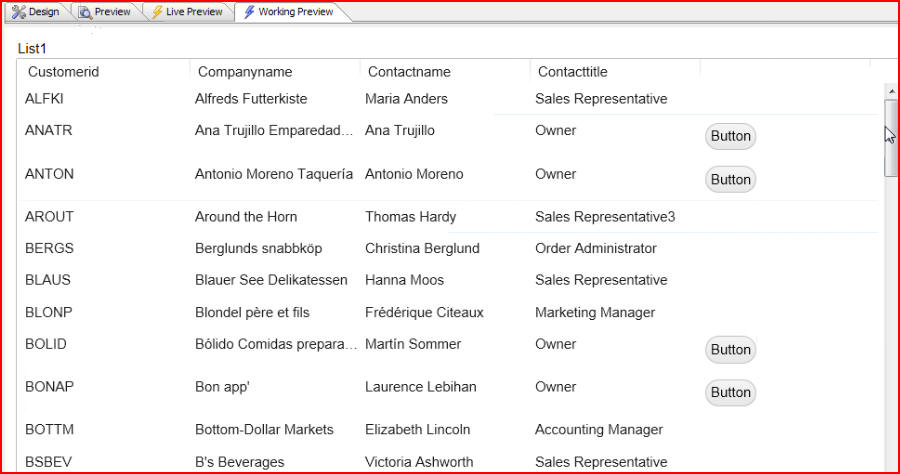
In this example we are displaying a list that has customer data from the Northwind database, and by default the list displays all the records in the table subject to whatever query we specify. If the list were larger we might not want to display all the data at once. We might want to paginate the list in order to help it run more efficiently and load more quickly.
(Note: Northwind is a sample Microsoft Access database that is shipped with Alpha Anywhere. It can be found in the 'MDBFiles' folder in the folder where Alpha Anywhere is installed):
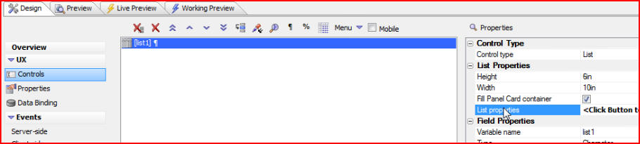
To do that click on the Design tab, then List properties:
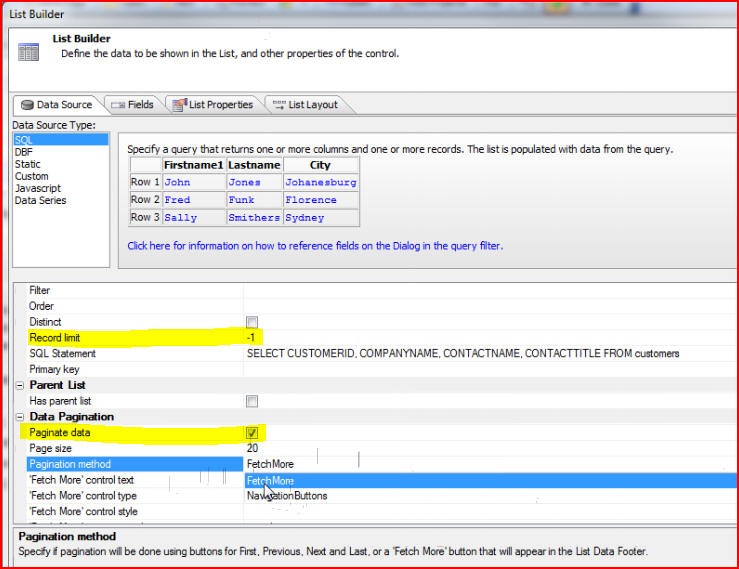
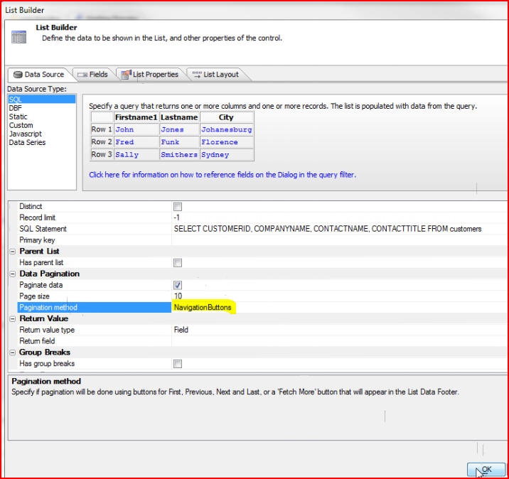
When the List Builder window opens we see that the Record limit is set to -1, which means we would like to fetch all of the data. In order to paginate that data we must check the box next to Paginate data, then choose which Pagination method we would like to use. We will demonstrate the FetchMore method first:
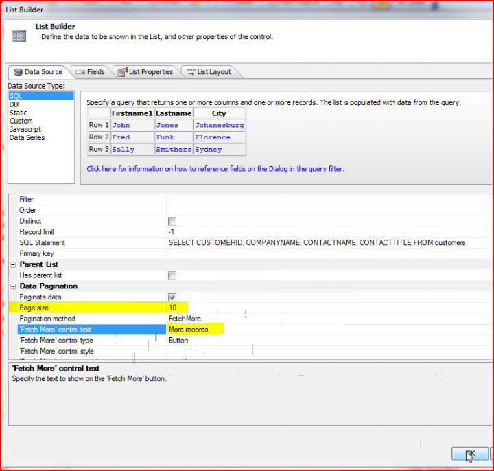
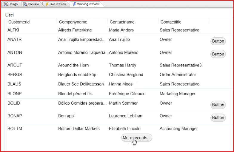
Let's specify the Page size as 10, and the 'Fetch More' control text to say More records... then click OK:
When we click the Working Preview tab we see that our list only displays 10 rows of data, and there is a More records... button at the bottom. When we click that button we will perform an Ajax callback to get the next 10 rows of data. When there is no more data to display, the More records... button will no longer appear at the bottom of the list:
Now let's take a look at the other pagination method, Navigation Buttons. Click the Design tab, then List properties to bring up the List Builder window again. This time we will choose NavigationButtons as the Pagination method. We will keep the Page size at 10. Click OK:
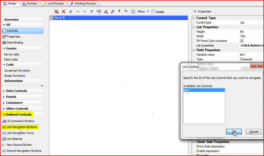
Since we chose NavigationButtons we must now put buttons on the component. Under Defined Controls click on List-Navigation Buttons, which are a pre-defined set of controls. Because the UX Component can contain multiple lists, the List Control window will open and we must specify which list we would like to be talking to with our navigation buttons:
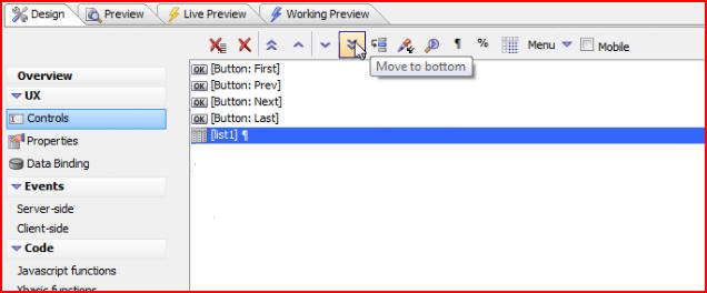
Click OK to close the List Control window and to see our navigation buttons. We would like our buttons to be displayed above our list, so we will move the list to the bottom by clicking the double arrows:
To see the code for our buttons that was written for us click onClick under Javascript:
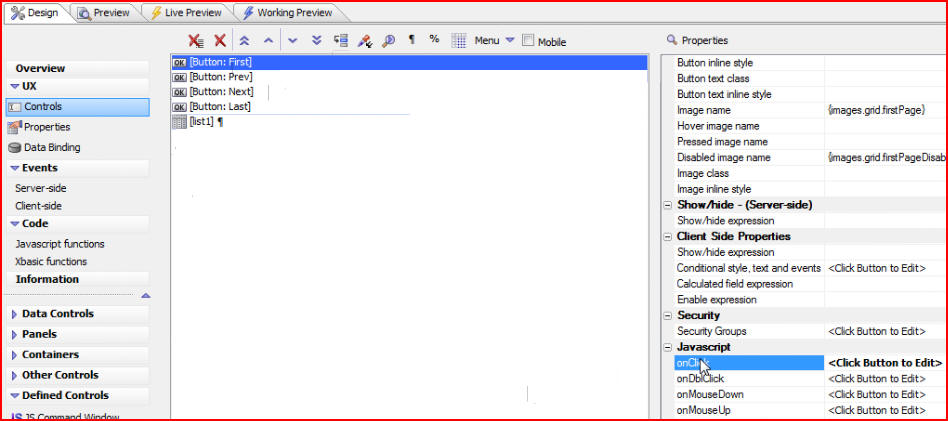
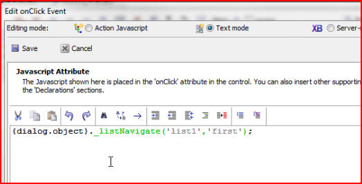
We see that the onClick event executes the list navigate method on list1, moving to the first record:
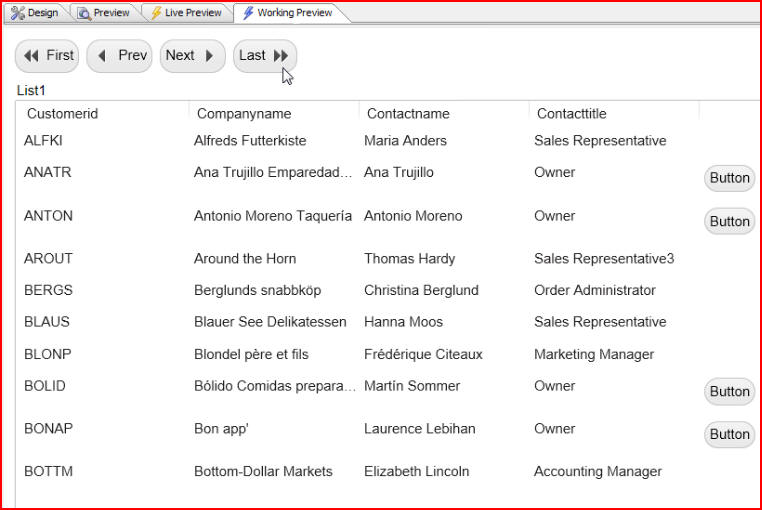
Now when we click on the Working Preview tab we see our navigation buttons at the top of our list, very much like we would in a Grid Component. These buttons allow us to navigate a very large list, while being extremely efficient: