In this document and accompanying video we will discuss how the List Control in the UX Component can have multiple layouts.
Creating multiple views of your data in the List Control and allowing users to switch from one layout to another at run-time is easily done.
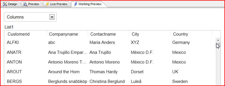
In this example we have a simple List Control that is based on the Northwind customer data.
(Note: Northwind is a sample Microsoft Access database that is shipped with Alpha Anywhere. It can be found in the 'MDBFiles' folder in the folder where Alpha Anywhere is installed):
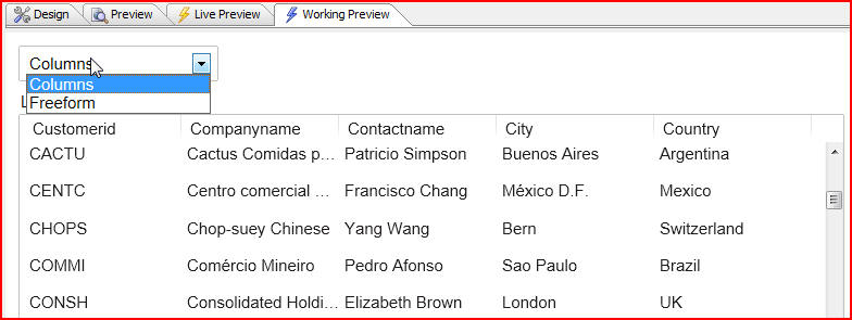
In our example we are only showing two possible layouts, Columns and Freeform, but of course there is no limit to the number of layouts we could add. When we choose from the dropdown box we can change the layout of the list from Columns to Freeform instantaneously. All that is happening when we change selections is that the same data that is used to populate the list is being rendered in a different way:
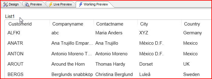
So let's take a look at how to add multiple layouts to a List Control. We will start with a List Control that has only one layout:
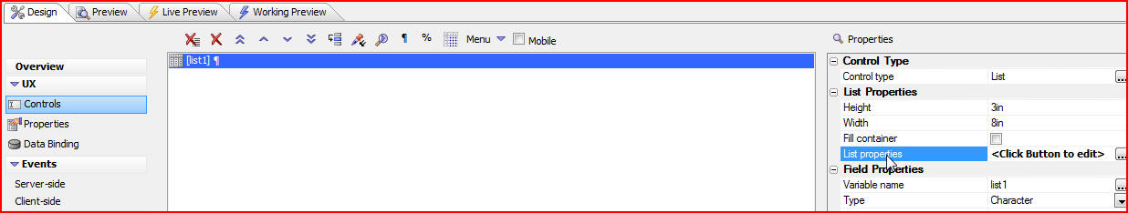
Let's now add multiple layouts to this list. Click on the Design tab, then List properties:
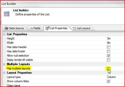
When the List Builder window opens click on the List Properties
tab. Now we want to specify that our list Has multiple layouts by
checking the box:
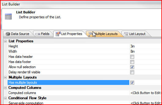
As soon as we check the box a new tab appears. Click the new tab, Multiple Layouts:
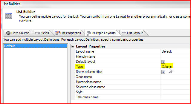
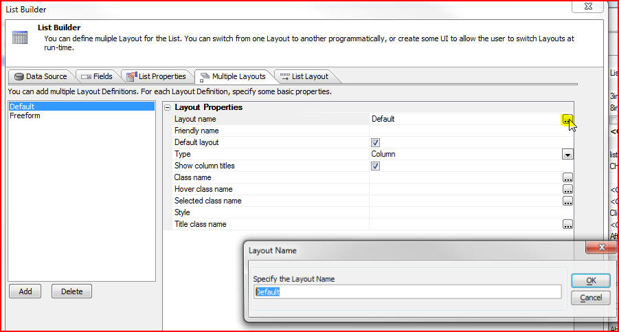
Now we can add new layouts. The first layout, Default, is already there and we can see the Type has been set to Column which means the list layout is simply a set of columns:
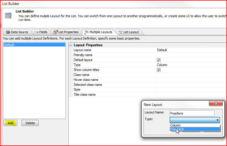
Let's add another layout by clicking the Add button, then naming it Freeform when the New Layout window opens. Select FreeForm as the type from the dropdown list, then click OK:
We now have two layouts defined, Default and Freeform. Let's change the name of Default to Column. Click on the smart field to open the Layout Name window. Type in Column to rename it. It is still our default layout, since the box next to Default layout is checked. Freeform will be our alternate layout:
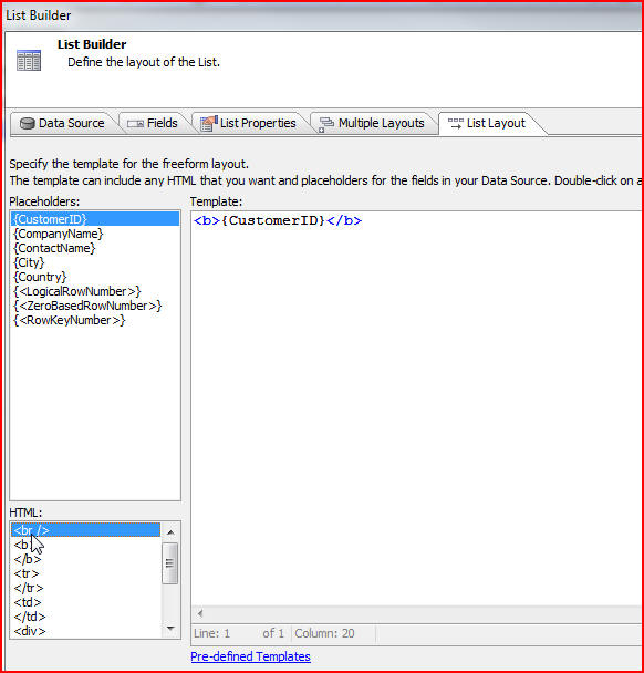
Click on the List Layout tab to specify the template of our freeform layout. We can select HTML and Placeholders, just as we did in our example below. We have put in an HTML bold tag (<b>), then a Placeholder for {CustomerID}, then closed our bold tag, and then put in a line break (<br/>):
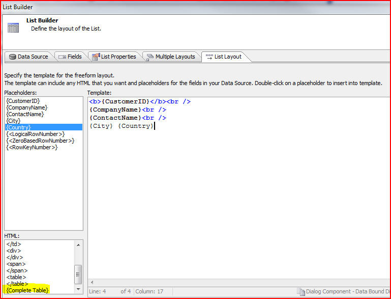
We continue to specify our freeform layout, choosing which Placeholders we want and putting in line breaks. As we define our layout we are free to use any HTML, or we can choose from the list of HTML tags for a quick-pick method of adding HTML. If we want to use a tabular layout we can click the {Complete Table} hyperlink which will prompt us for the number of rows and columns that we want in our HTML template:
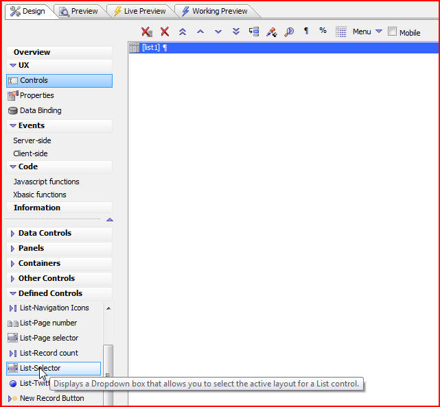
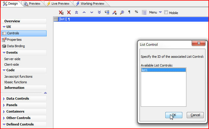
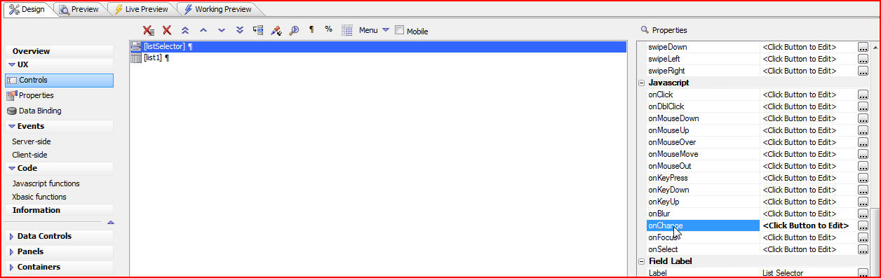
We now have our list with two layouts but there is currently no way for a user to select the alternate layout that we have defined, so click on the Design tab then List-Selector which is under Defined Controls:
The List Control window will open and will ask us which List Control on the UX Component we would like to control. There could be many different List Controls so we need to specify which one we would like to talk to. In our example there is only one so we will click on list1:
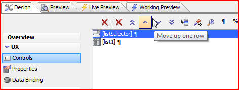
Click the up arrow to move the listSelector above our list:
When we click the Working Preview tab we see our columnar list and our dropdown box:
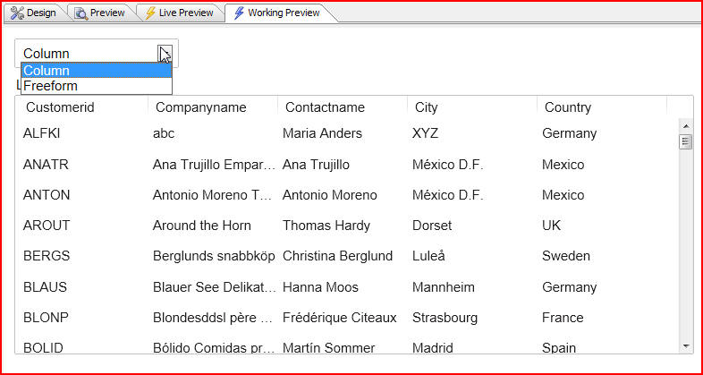
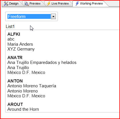
And our freeform list when we select it:
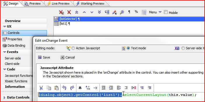
When we click on the Design tab we can examine our listSelector more closely by clicking the onChange event:
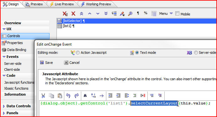
The Javascript that is being executed is saying first, get a pointer to the list object:
Then call the selectCurrentLayout, with the name of the layout that we want to select: