In this document and accompanying video we will discuss the difference between tabular layout and freeform layout of a List Control on a UX Component.
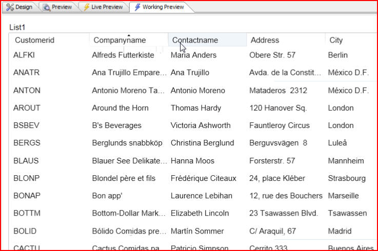
In this example we have a List Control that has been populated with a SQL query from the Northwind customer table in a tabular format. If we click on column headings the client-side sorting is extremely quick.
(Note: Northwind is a sample Microsoft Access database that is shipped with Alpha Anywhere. It can be found in the 'MDBFiles' folder in the folder where Alpha Anywhere is installed):

Let's take a look at the design of the List Control. Click on the Design tab, then List properties:

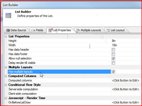
When the List Builder window opens we click the List Properties tab and see that we have checked the Has multiple layouts box:
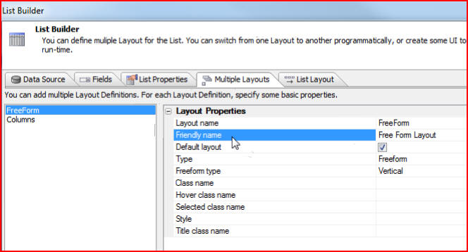
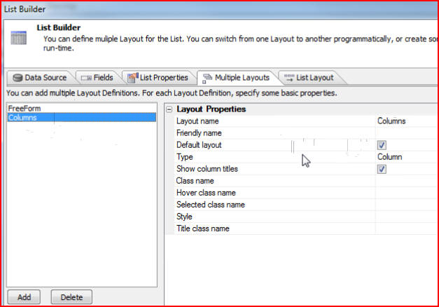
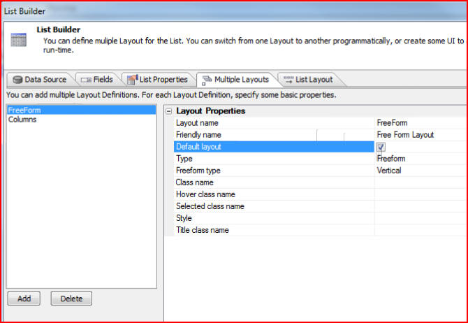
Under the Multiple Layouts tab we see that there are two layouts specified, although we could add as many different layouts as we would like. The first layout we have specified as the FreeForm layout, and the second layout is Columns, which we have designated as the default layout:
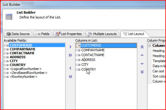
Let's take a look at the Columns layout by clicking on the List Layout tab. We see that for this example we have selected these columns from the list of available fields:
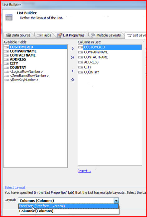
We can compare that layout with the FreeForm layout by selecting that at the bottom of the List Builder window:
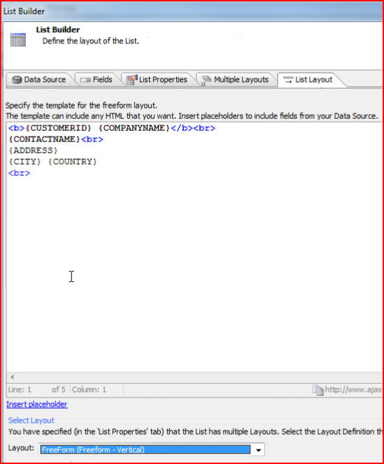
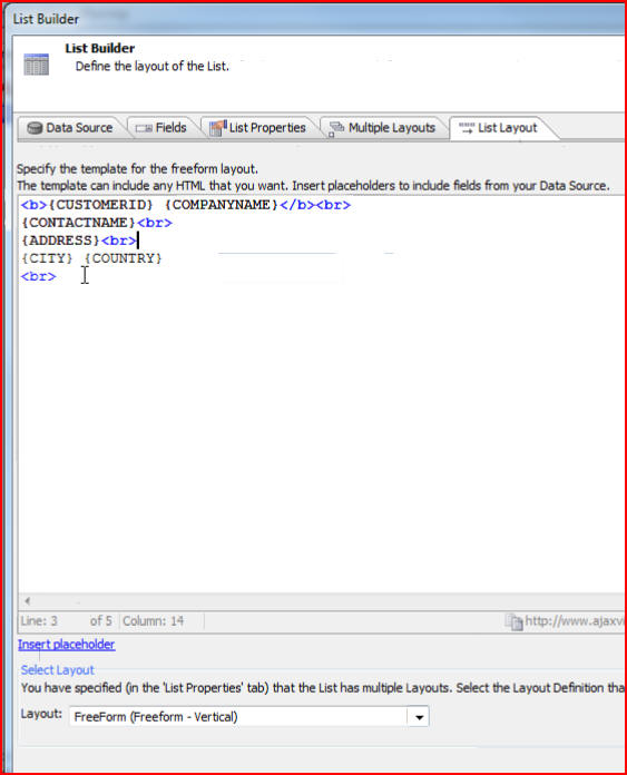
What we see in the FreeForm List Layout is a screen that shows the ability to enter any arbitrary HTML mark up, and then in the mark up to use placeholders for the fields that are in the query for the list data source:
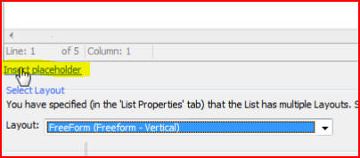
Click on Insert placeholder to see the different placeholders that are available:
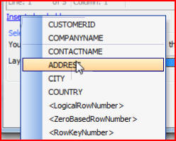
In the List Builder window we can enter arbitrary HTML. In this example we have specified that the CUSTOMERID and COMPANYNAME are on the first line, and are in bold. Then we have a line break ( <br> ). On the next line we have CONTACTNAME followed by another line break. Then we specify ADDRESS on a line by itself, a line break, then CITY and COUNTRY on a line together:
Let's click the Multiple Layouts tab now and change the Default layout to FreeForm. Click OK then Save:
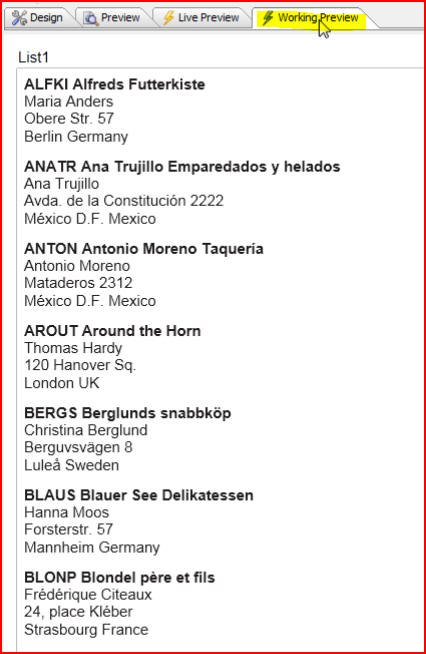
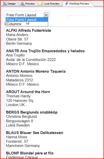
Now when we click on the Working Preview tab we see the same data in the list, but it has been formatted as a freeform list:
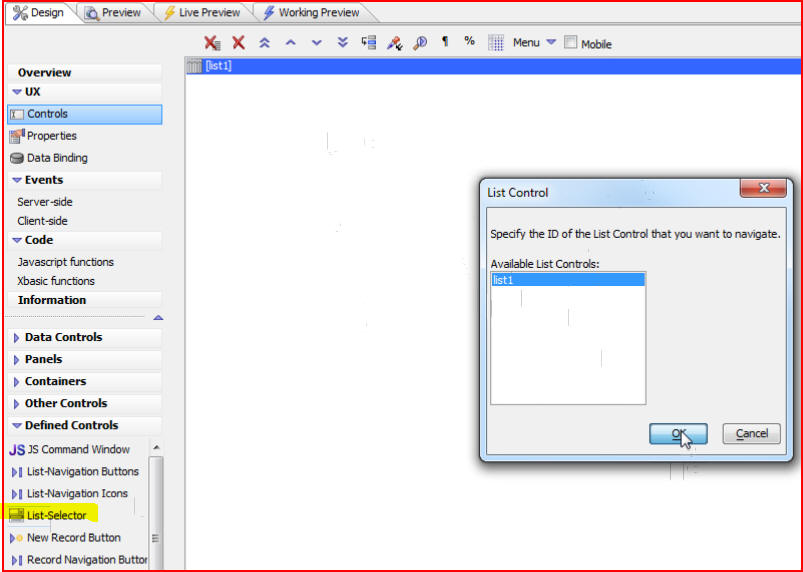
In this particular example we specified what the default layout should be at design time but we can also choose the layout programmatically, and can even put a control on the dialog to allow us to select the list at run time. Mobile applications often switch from one list layout to another list layout in the on-orientation change event that the mobile device raises. So let's look at how we can programmatically change from one list layout to another list layout. Click on the Design tab, then under the Defined Controls heading click one of the predefined controls called List-Selector. This will bring up the List Control window which will let us choose which list we would like to control, because remember there can be multiple List Controls on the component so we need to specify which list we are going to be talking to. In this example we will select list1 then click OK:
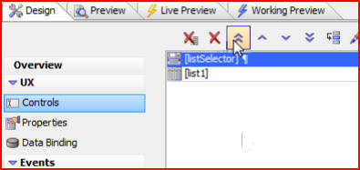
Now we will click the double up arrow to move listSelector to the top of the screen:
When we click on the Working Preview tab we see that the list selector renders as a combo box and the choices are choices that we defined in the builder:
If we choose Columns we see the list rendered as columns:
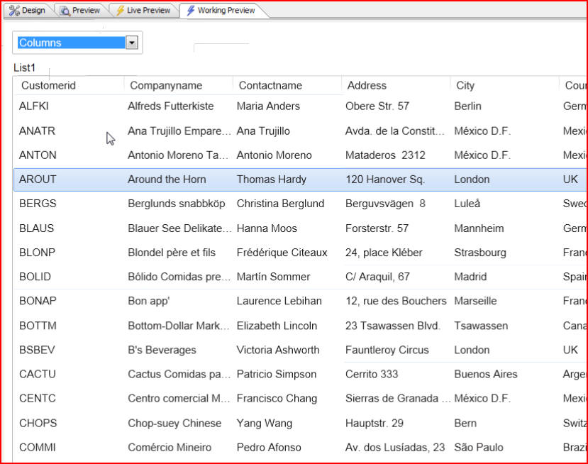
It is important to note that no Ajax call back is taking place because the data for the list has already been sent down to the client and we are just formatting the list into different layouts using the JavaScript methods that the List Control has. The choices Free Form Layout and Columns are just friendly names that we defined when we defined the multiple layouts:

