In this document and accompanying video we show a new feature of the chart control, which is the ability to control colors for data points at the individual data series level.
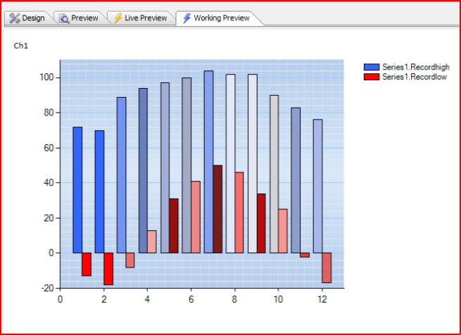
We see on this chart is that we are plotting two different data series, using bar charts for both data series. Series1.Recordhigh starts out using a darker blue, but each data point in the series changes color, so we are actually controlling the color of the data points at the individual data series level.
The second data series, Series1.Recordlow, starts out as red and progresses through different shades as we cycle through additional data points.
Previously we could control data point colors, and in this particular case data point colors mean bar colors, for all of the data series that were plotted on the chart. Now we can control it at the individual data series level.
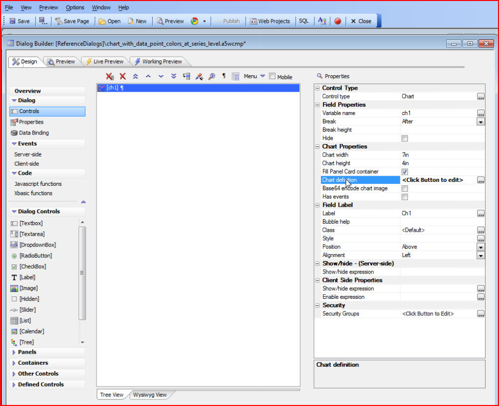
The way this is done is by editing the Chart CSS. Start by clicking on the Design tab then Chart definition:
Then edit the Chart Style:
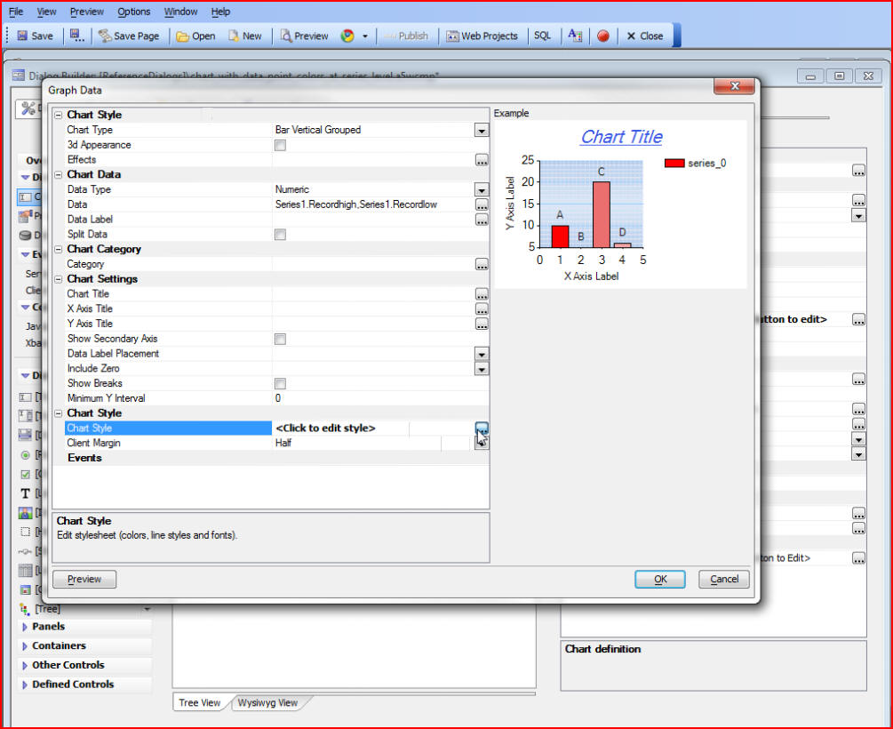
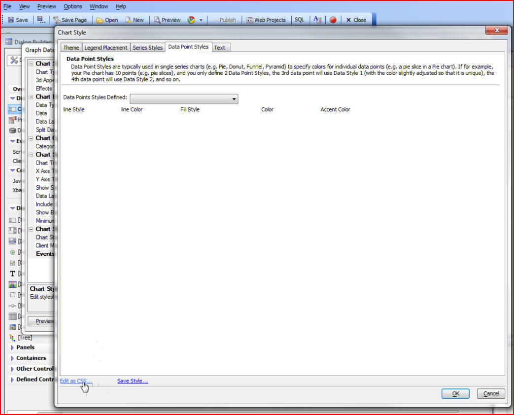
We will not be able to accomplish our goal through the built-in Data Point Style builder because it will not give us control at the individual data series level, so we must go to the actual CSS by clicking on Edit as CSS at the bottom of the Chart Style window:
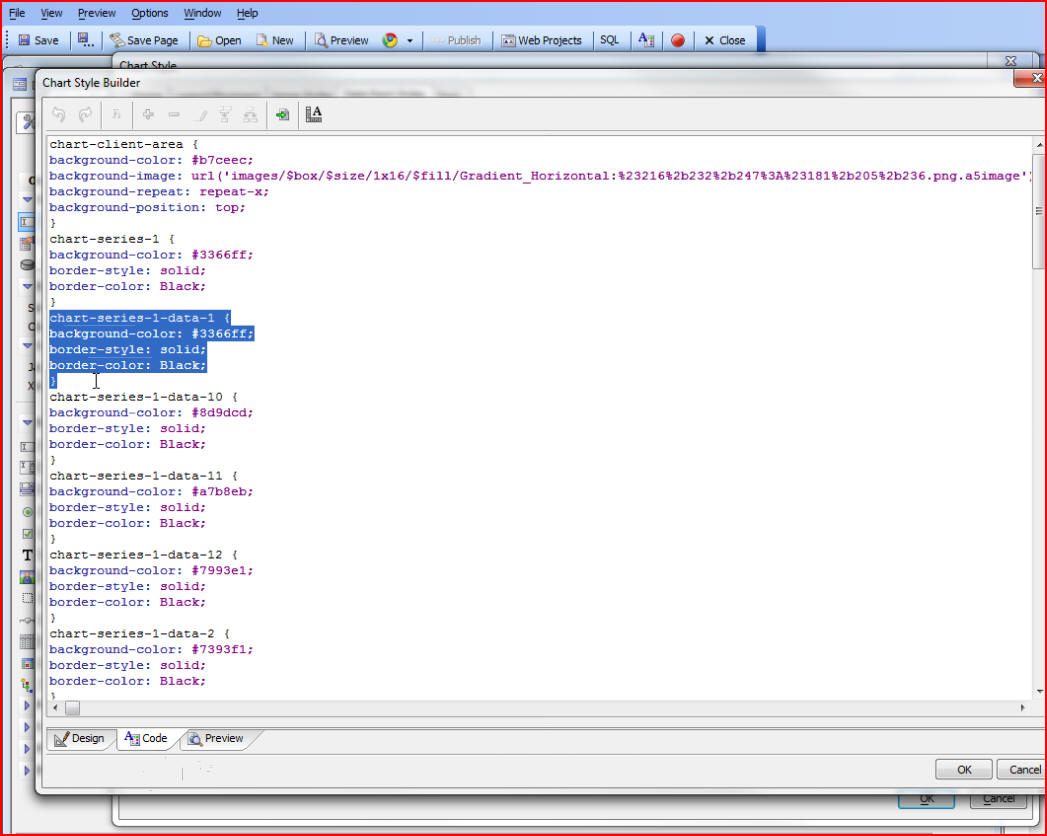
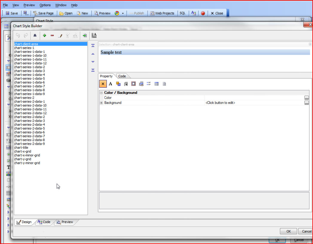
In the CSS we have added selectors for data points at the individual series level. In this example we can see defined data point styles for each of our two data series (data points one through twelve for Series1.Recordhigh, and data points one through twelve for Series1.Recordlow):
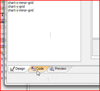
If we click on the Code tab at the bottom of the window we will be able to see the code for those data points:
The highlighted section below shows the style for the first data point in Series1.Recordhigh on our chart. Each data point has its own style giving us control over each individual data point: